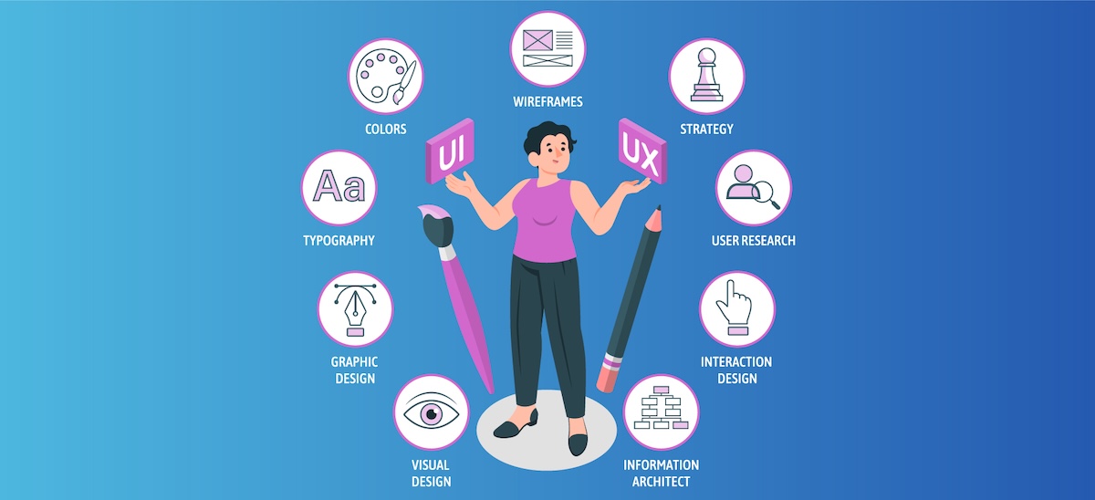
In today's multi-device world, responsive design isn't just a nice-to-have feature—it's essential. Users expect seamless experiences whether they're on smartphones, tablets, laptops, or desktop computers. This article explores the fundamental principles that will help you create truly responsive websites.
Fluid grids form the foundation of responsive design. Unlike fixed-width layouts, fluid grids use relative units like percentages rather than absolute units like pixels. This approach allows content to flexibly resize based on the viewport. Combined with CSS Grid and Flexbox, you can create sophisticated layouts that adapt intelligently to different screen sizes.
Flexible images and media are equally important. Using the max-width property ensures that media never exceeds its container while maintaining its aspect ratio. Modern techniques like picture elements and srcset attributes allow you to serve appropriately sized images based on the device, improving both visual quality and loading performance.
Media queries remain a powerful tool in responsive design, allowing you to apply different styles based on device characteristics like screen width, height, or orientation. However, a mobile-first approach—where you design for mobile screens first, then progressively enhance for larger screens—often leads to more efficient and user-friendly designs.
Performance considerations are crucial for responsive sites. Mobile users may have limited bandwidth or processing power, so optimizing load times through techniques like lazy loading, code splitting, and asset optimization ensures a good experience across all devices.
Finally, testing on real devices is irreplaceable. While browser dev tools provide useful simulation capabilities, nothing beats seeing how your design performs on actual smartphones, tablets, and different desktop configurations.


